
I picked this ad because it uses complementary colors. The orange is a giant logo for the company that is made to look like a skate park. The blue sky is a complementary color to the orange logo. This helps the advertisement because the contrasting color makes the reader stop and look at the ad.
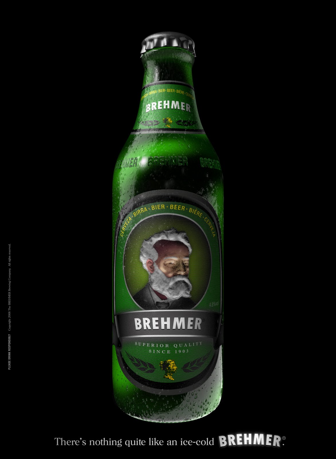
I picked this ad because it was interesting to me. The bright green against the black background really makes it stand out. The reason for the green element is because that is the color of the product. The reason for the black is to make their product stand out. The advertisement is monochromatic because there are different shades of green in the bottle.
No comments:
Post a Comment