Friday, July 30, 2010

Journal 20: And Then He Said


Once upon a time in a city of gray blocks.


There was an engineer named John who built machines that look like this.


But there was too much math that didn't make any sense.


So he bought a race car to drive far away from anywhere that has numbers.


He ended up in a jungle and decided to be Tarzan.

Thursday, July 29, 2010

journal 19: myth


Cigarette companies use myth in their ads very frequently. Sometimes they make smoking look cool or sexy. In this case there is a cowboy looking figure smoking their cigarette. This could be appealing to teenage boys who use cowboys as role models. They might think that if they smoke they could be like this guy.

The guy in the ad obviously is doing pretty good with the ladies. Some people might see that he is an attractive rough neck guy and that is what they want to be. He is smoking so that means that they need to smoke.

Wednesday, July 28, 2010

journal 18: Advertisements & Jefkins


This is an advertisement for a yoga school in Hong Kong. It uses Frank Jefkin’s three basic principles of effective advertisement writing. The advertisement is very concise the only words are the name of the yoga place. The advertisement is very simple, interesting and gets the point off very quickly.

journal 17: Advertisements & Color


I picked this ad because it uses complementary colors. The orange is a giant logo for the company that is made to look like a skate park. The blue sky is a complementary color to the orange logo. This helps the advertisement because the contrasting color makes the reader stop and look at the ad.


I picked this ad because it was interesting to me. The bright green against the black background really makes it stand out. The reason for the green element is because that is the color of the product. The reason for the black is to make their product stand out. The advertisement is monochromatic because there are different shades of green in the bottle.

journal 16: Logos & Color Meaning


The Firefox logo uses complementary colors. Within each color there are several shades of that color. Each color takes up about half of the logo. They use the blue to represent to world and the orange fox around the world shows that it connects the world together.


The Wikipedia logo is monochromatic. It uses several shades of gray to make it look like a three dimensional sphere.


The google logo and the ebay logo both use the same color scheme. They are both double complementary. These are both very successful and well known logos so the color scheme must work. The bright contrasting colors make these logos appealing and friendly.

Friday, July 23, 2010

Journal 15: CONNOTATION & DENOTATION

Evil is the connotation. I picked the eye because an eye is not something evil but it looks evil. I picked the devil for denotation.

God is a higher power so I used a cloud. Religion usually puts a figure on the idea of a god.

I used ancient writing for history. When I think of war I think of political leaders.
Justice is when things are in balance. The gabble is a symbol for court


This sitting area is in order. The alphabet has a particular order.

This isn't an image of pain but it makes the viewer think of pain. I didn't want to get gory on this so I picked the arm in a sling.

I actually took the picture of this peace sign the other day and thought it would work. Hippies are what I think of when I see the word peace.

The picture for rage is an abstract idea of what rage is. The kitten is full of rage.
Gears in the head replace the brain with machines which are smart. Brains is what I think of when I see smart.

Thursday, July 22, 2010

journal 14: advertisement 3


I chose this advertisement because the creative figure of speech used.

The cultural myth used is that art is all visible. Usually art seen or heard and not tasted. The relationship between the target audience and the ad is that the target audience are the people reading cooking magazines. The target audience would understand the myth.

The advertisement tells that happiness is achieved through their food. Their food is so good that it is a fine Italian art.

This ad is playing off the desire that people want good food. Everyone needs food.

journal 13: advertisement 2


I picked this advertisement because it actually tells the reader that they have a problem. Sorry about the glare again, I need to invest in a scanner.

This ad states that if you are on their list of lactose intolerant ethnic groups then you have a problem and they are there to help you. If someone on the list then the problem is that they can't use protein shake because they have milk in them. A cultural myth is that protein shakes are necessary for building muscles. Another cultural myth that is used in this ad is that someone needs to have muscles, and if not then they have a problem.

The man that is pictured is a sign of the people who have a problem, he is sad because he has the same problem that the reader has.

This ad is playing off of the readers desires because they want to have muscles but it is hard to achieve that if they are lactose intolerant without this product.

journal 12: advertisement 1


This is an advertisement for a concealed gun holster. I don't have a scanner so I just used my camera to take a picture sorry about the glare.

I picked this ad because it is playing off of the readers fears. It states "better safe then sorry" the ad is trying to state that if you don't carry a gun you may be sorry. It is a cultural myth that if someone carries a gun they will be safer. If the defender has a gun chances the attacker has a gun as well, if they see the target unarmed then they have no need to pull a gun, but if their target pulls a gun on them then they will likely do the same.

The target audience for this advertisement is they type of people that read gun magazines. When I think of gun magazines macho men come into mind. The men that think that they need to protect their family. The ad is trying to put fear into their minds so they will buy their product.

Wednesday, July 21, 2010

journal 11: walk, don't walk

I used illustrator to draw everything for this project. I just used the pen tool and lines and shapes.

Fly or don't fly. When I wake up in the morning the first thing I do is check the weather. If the weather is fine then I fly if there is a cross wind I don't fly. The airplane is blue because blue is a calm color and it is also the color of the sky.The wind sock is orange because it means caution if it is windy.

Sandals or shoes. The sandals are yellow because the sun is yellow and if it is hot then I wear shoes. The shoes are brown because usually when I wear shoes it is muddy.


Cook or go out. The sauce pan represents cooking and the spoon and fork is a common sign for restaurant.


Go on internet or sleep. Every night after work I either get out the computer or I just go to bed.


Radio or ipod. When I'm driving or at home I always have to decide if I want to listen to the radio or ipod.

Friday, July 16, 2010

Journal 10: Metaphor

The search for opportunities could be like finding a needle in a hay stack. I think this ad is successful.

Thursday, July 15, 2010

journal 9:inventions

Great inventions:

1. The Jupiter Jack. I was wondering around Wall greens and I came across the as seen on tv isle. This item plugs into your phone and sends a FM signal to your radio so you can hear the speakerphone. This will save lives.

2. Magic Jack. Plug this into a computer then plug a phone into this and you have a phone for 25 bucks a year. That's less than most people pay a month.

3. Slap chop. put in stuff that needs to be diced. push repeatedly.

4. Sound amplifier. looks like a blue tooth device but actually is a sound enhancer so you can hear whats going on around you.

5. Topsy turvy. new way of growing vegetables doesn't take up ground space

6. Airplane. goes fast and a lot of fun.

7. Cheese cutter. cuts even the hardest cheeses with ease because it utilizes a thin wire.

8. digital camera. It took me a while to figure out how to take a picture of my camera with my camera but after I thought of using mirrors in a bathroom it was pretty easy.

9. Automobile. probably the most important invention since the wheel.

10. Cell phone. you can do more with a modern cell phone than with a 12 year old computer.

Things I can't live without:

1.The toothbrush. The first thing I do in the morning and the last thing I do at night.

2. Deodorant. This one is pretty obvious.

3. My MacBook. I am on it about 18 hours a day.

4. A hammock. I wish I could be on this 18 hours a day.

5. box fan. Air conditioning system for my house. put one in the window. then open window on other side of house. close windows during the day.

6. Toaster. I couldn't imagine having to eat cold soft bread every day.

7. Ipod. Where the computer can't go this can.

8. Water. I might have taken this one a little to literally.

9. Seasonings. I love to cook.

10.cell phone. Connects me to the people that I am not physically with.

Wednesday, July 14, 2010

journal 8: emotions

Angry:


1. I chose this because it is a good display of anger in an animation.

2. This is a very angry man.

3. It was hard choose to put this in angry or scared. I put it as angry because angry things are often scary.

4. A drawing that accurately depicts anger.

5. Eyebrows are something that 1,2,3, and 5 have in common. They all are slanted.
O\ /O
....u
(angry face)
...O

Sad:


1. Raining on a flower. The way that this picture was taken just makes it sad. The large blurred background and the small flower in the corner being pelted with rain.

2. Adding rain to something can easily make it look sad. Pandas are usually happy, but now when they are being rained on.

3. The way that eyes and mouth are shaped makes this loo
k sad.

4. This one is not just facial expression but the body language.


5. A sad baby can make anyone sad.

=( (sad face)

Joyous!:

1. Money generally makes people happy.

2. Fireworks are usually for celebration and celebration is joyous

3. Simple symbol for happiness

4.Video games are fun.

5. This flower is very similar and a lot different than the previous flower. Both are in a corner, water is involved and the background is darker. This one is much happier though because it is brighter and everything is in focus.

:D (joyous face)


Uninspired:

1. I was looking for uninspired pictures and I looked over at my dog for help. As always the dog came through so I took a picture of her.

2. Even if the words weren't there I would think that that is what he is thinking.

3. I wouldn't be very inspired if this guy was telling me to be serious.

4. Rap music is pretty uninspiring to me already but this album cover puts the nail in the coffin.

5. Anime uses emotions a lot.
:/ (uninspired face)


Scared:

1. I would be pretty scared if I saw this.

2. This was an easy easy picture for me to pick to put in scared.

3. The facial emotion isn't that scared but the fact that it is in black and white and she is looking past the camera makes her look scared.

4. Anyone would be scared if they were put in a straight jacket in a padded room.

5. Death sitting in the back seat of your car would be pretty scary.

:O (scared face)

journal 7: I'm against it.


This is supposed to represent a factory that is producing coffins. The only elements used are simple symbols that represent cigarettes and lines for smoke.

journal 6: ransom note

Friday, July 9, 2010

journal 5: new symbols

I think that signs designating everyday things should be simple and easy to understand. All of my redesigned signs are very simple and hopefully easy to recognize.


This is the executive washroom. Just a normal restroom sign with the addition of a crown showing that this is not for filthy pheasants.


This exit sign may have been used before but I have not seen one just like it. It is simple and it tells a person where the exit is.


I really wanted to get more creative with this one. A simple drawing of a car going into a layered building with large doors would be an easy to recognize sign for a parking garage.


The women's restroom shows a figure sitting while the men's show a urinal. The fire extinguisher is a hammer pounding on a fire. and the janitors closet is simply a figure holding a broom.

Journal 4: arrow heaven

1. Movie gallery. The V has been rotated 90 degrees and now it looks like an arrow. This was in my sisters room.


2. I would have never noticed the arrow on this product if not for this assignment. I don't really understand why it is there though. This was in my sisters room.


3. This tree is a simple decoration but as I was looking for arrows it caught my eye. This was in the living room.


4.The flame on a candle looks like an arrow if you use your imagination. This was in the kitchen.


5. This is a Bird house but also a very cool arrow. This was in the kitchen.


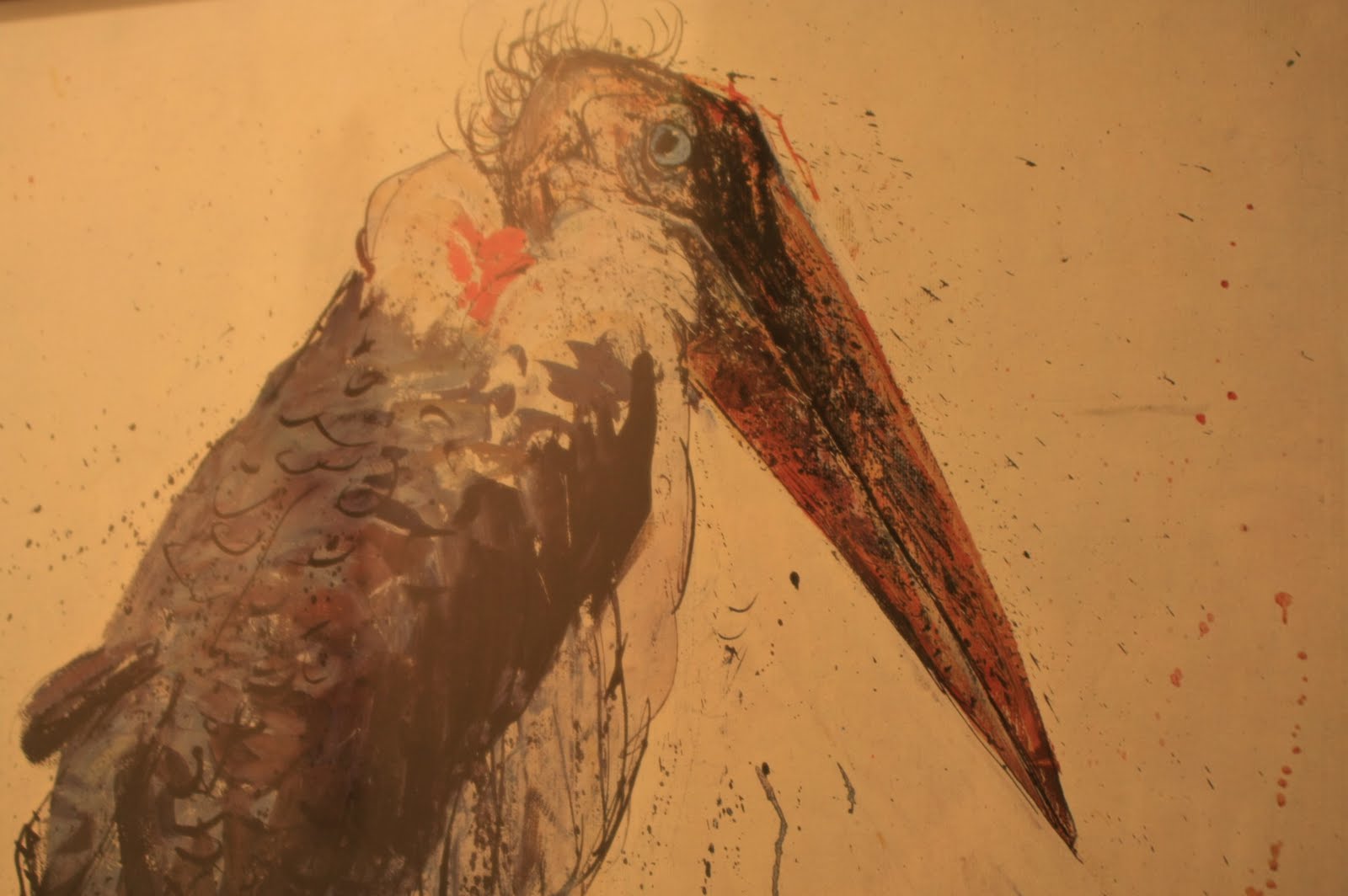
6. This arrow is on a very strange bird. This was in the office


7. This is my car key. I actually thought of this before I saw it. This was in my pocket.


8. I saw this pen as I was pulling out my car keys. Arrows are everywhere. This was in the kitchen


9. I saw this clip from across the room.


10. The strap on this sandal.


11. The point on the bottom of a heart. I never noticed that it could be an arrow


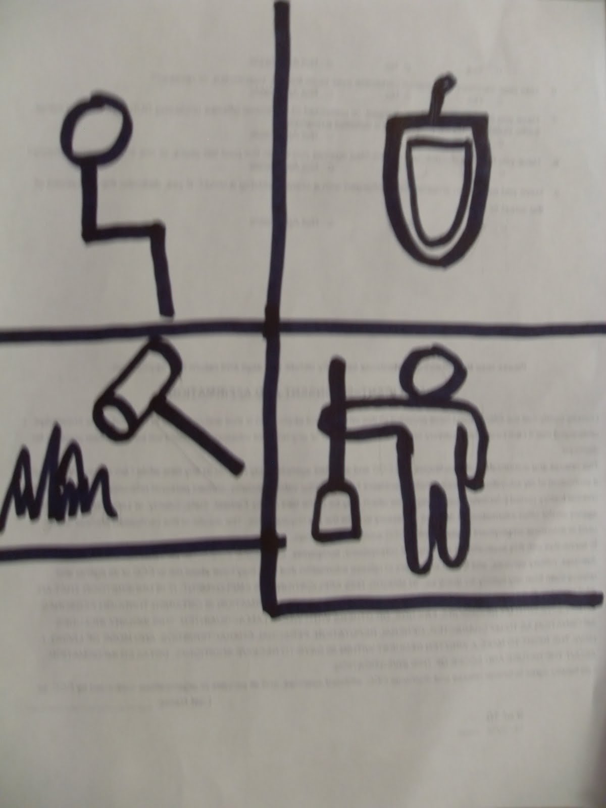
12. Hands on a clock. This came to mind as I was reading the article. I bet you cant guess the time I took this picture at.


13. Now I'm in Walmart. Lots of arrows.


14. I could see this one very easily, I guess that is a good thing.


15. I thought that it was strange that the rollback arrow was pointing up. Shouldn't it be pointing back or even down signify lowering prices?


16. This one is better lowering prices and an arrow going down.


17. This one seemed a little redundant. I don't even know what a spill center is.


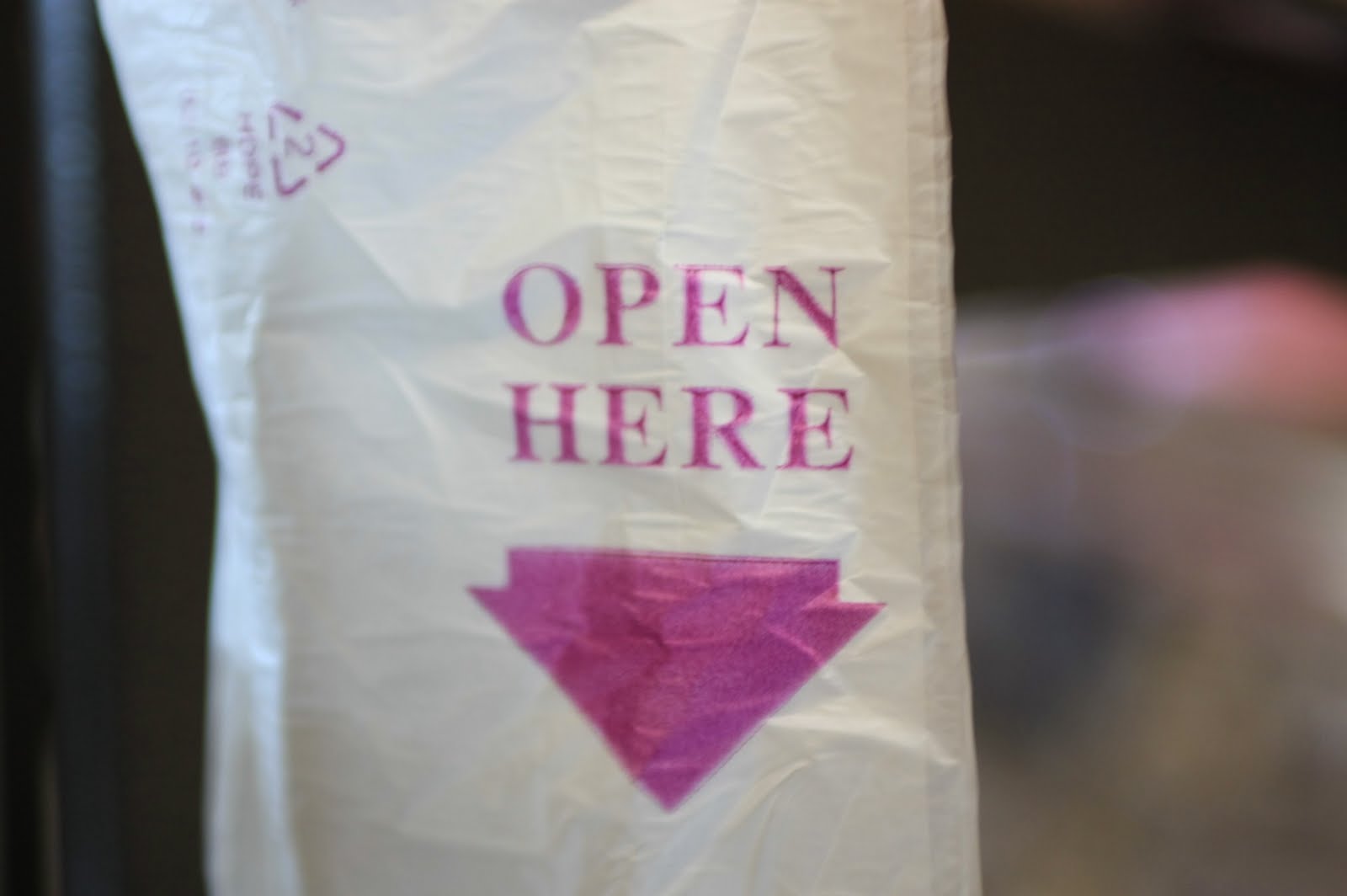
18. There are actually two examples of arrows in this picture. In the top left of the bag there is a recycle symbol.


19. This is not a typical this side up arrow but I think that is what it means.


20. These arrows must be a logo for what ever is on that sign. (I forgot what the sign was for, I must have been to preoccupied with the cool looking arrows.)