Friday, July 30, 2010

Journal 20: And Then He Said


Once upon a time in a city of gray blocks.


There was an engineer named John who built machines that look like this.


But there was too much math that didn't make any sense.


So he bought a race car to drive far away from anywhere that has numbers.


He ended up in a jungle and decided to be Tarzan.

Thursday, July 29, 2010

journal 19: myth


Cigarette companies use myth in their ads very frequently. Sometimes they make smoking look cool or sexy. In this case there is a cowboy looking figure smoking their cigarette. This could be appealing to teenage boys who use cowboys as role models. They might think that if they smoke they could be like this guy.

The guy in the ad obviously is doing pretty good with the ladies. Some people might see that he is an attractive rough neck guy and that is what they want to be. He is smoking so that means that they need to smoke.

Wednesday, July 28, 2010

journal 18: Advertisements & Jefkins


This is an advertisement for a yoga school in Hong Kong. It uses Frank Jefkin’s three basic principles of effective advertisement writing. The advertisement is very concise the only words are the name of the yoga place. The advertisement is very simple, interesting and gets the point off very quickly.

journal 17: Advertisements & Color


I picked this ad because it uses complementary colors. The orange is a giant logo for the company that is made to look like a skate park. The blue sky is a complementary color to the orange logo. This helps the advertisement because the contrasting color makes the reader stop and look at the ad.


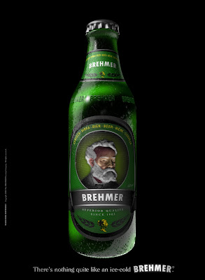
I picked this ad because it was interesting to me. The bright green against the black background really makes it stand out. The reason for the green element is because that is the color of the product. The reason for the black is to make their product stand out. The advertisement is monochromatic because there are different shades of green in the bottle.

journal 16: Logos & Color Meaning


The Firefox logo uses complementary colors. Within each color there are several shades of that color. Each color takes up about half of the logo. They use the blue to represent to world and the orange fox around the world shows that it connects the world together.


The Wikipedia logo is monochromatic. It uses several shades of gray to make it look like a three dimensional sphere.


The google logo and the ebay logo both use the same color scheme. They are both double complementary. These are both very successful and well known logos so the color scheme must work. The bright contrasting colors make these logos appealing and friendly.

Friday, July 23, 2010

Journal 15: CONNOTATION & DENOTATION

Evil is the connotation. I picked the eye because an eye is not something evil but it looks evil. I picked the devil for denotation.

God is a higher power so I used a cloud. Religion usually puts a figure on the idea of a god.

I used ancient writing for history. When I think of war I think of political leaders.
Justice is when things are in balance. The gabble is a symbol for court


This sitting area is in order. The alphabet has a particular order.

This isn't an image of pain but it makes the viewer think of pain. I didn't want to get gory on this so I picked the arm in a sling.

I actually took the picture of this peace sign the other day and thought it would work. Hippies are what I think of when I see the word peace.

The picture for rage is an abstract idea of what rage is. The kitten is full of rage.
Gears in the head replace the brain with machines which are smart. Brains is what I think of when I see smart.

Thursday, July 22, 2010

journal 14: advertisement 3


I chose this advertisement because the creative figure of speech used.

The cultural myth used is that art is all visible. Usually art seen or heard and not tasted. The relationship between the target audience and the ad is that the target audience are the people reading cooking magazines. The target audience would understand the myth.

The advertisement tells that happiness is achieved through their food. Their food is so good that it is a fine Italian art.

This ad is playing off the desire that people want good food. Everyone needs food.